Case study — Sri Lanka
Rooms inland. A café steps from the beach.
- Client
- Sisters Sri Lanka
- Where
- Kabalana, Ahangama — Sri Lanka
- Scope
- Brand identity · Website · Copy · Technical SEO
- Year
- 2026
- Duration
- Five weeks, against a brief of six to eight
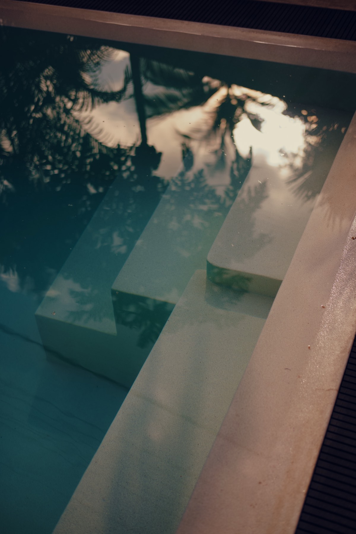
The pool at Sisters Away — the new crest, cast large on the wall beside it.
Burcu and Burçin, two sisters from Istanbul, came to Ahangama and stayed. By 2026 they had four rooms, a villa, a fully vegetarian Mediterranean café and fourteen women from the village on the payroll — 417 Google reviews at 4.9, and fourteen thousand people following along.
What they did not have was a website, or a brand. Instagram was the shopfront. Bookings arrived through Booking.com and Airbnb, and they paid for every one.
01 The structure
Two doors, one grove
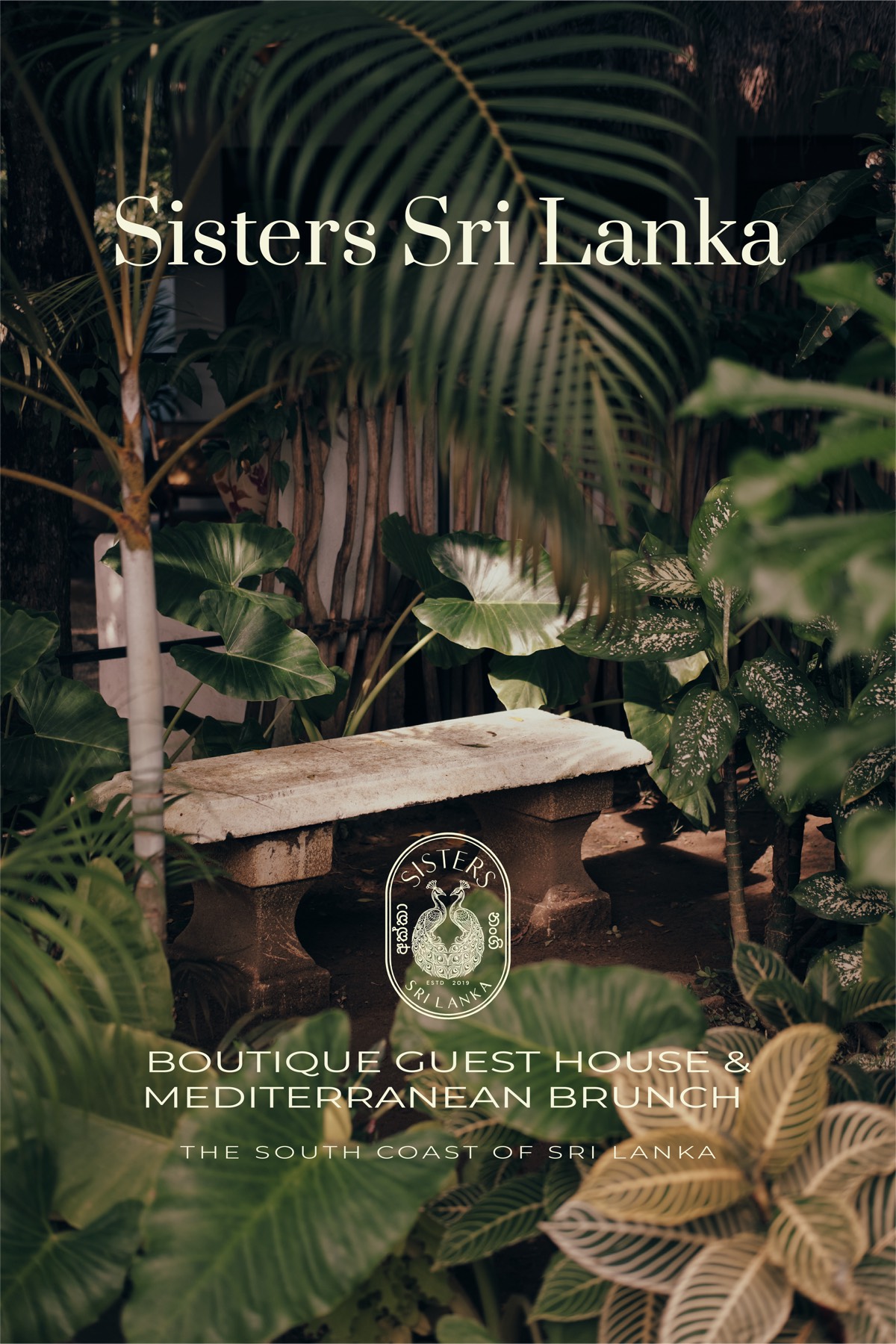
The rooms sit inland on a quiet road. The café is 800 metres away, twenty metres back from the beach at Kabalana. A guesthouse asks you to commit — dates, names, how many. A café asks nothing except that you turn up before four. Those are opposite jobs and they do not share a page well.
So the site runs at two speeds under one roof: Sleep, Eat, Shop. Sleep slows you down and asks for detail. Eat and Shop give you the hours and the walk, and get out of the way.
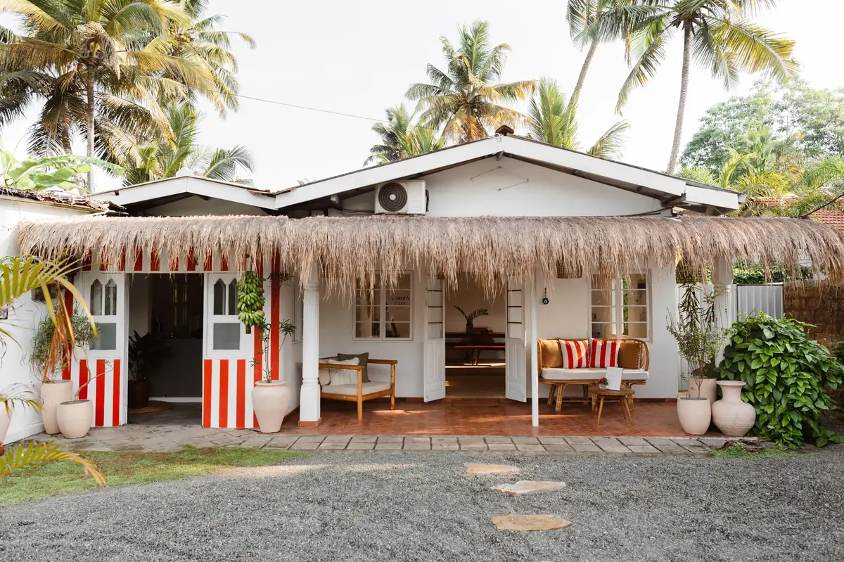
Eight hundred metres apart. One asks you to commit; the other asks you to turn up before four.
One of the two sisters, out past the break at Kabalana at dawn.
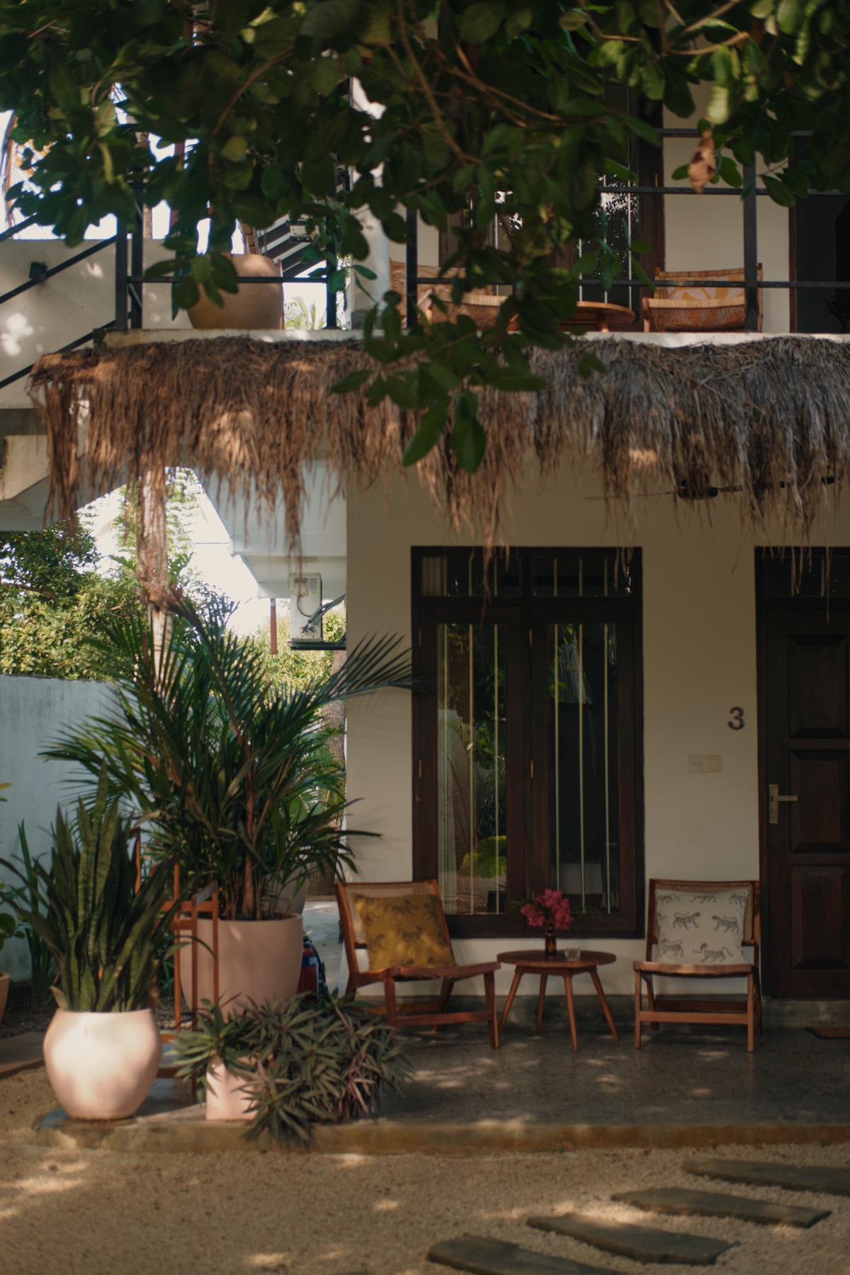
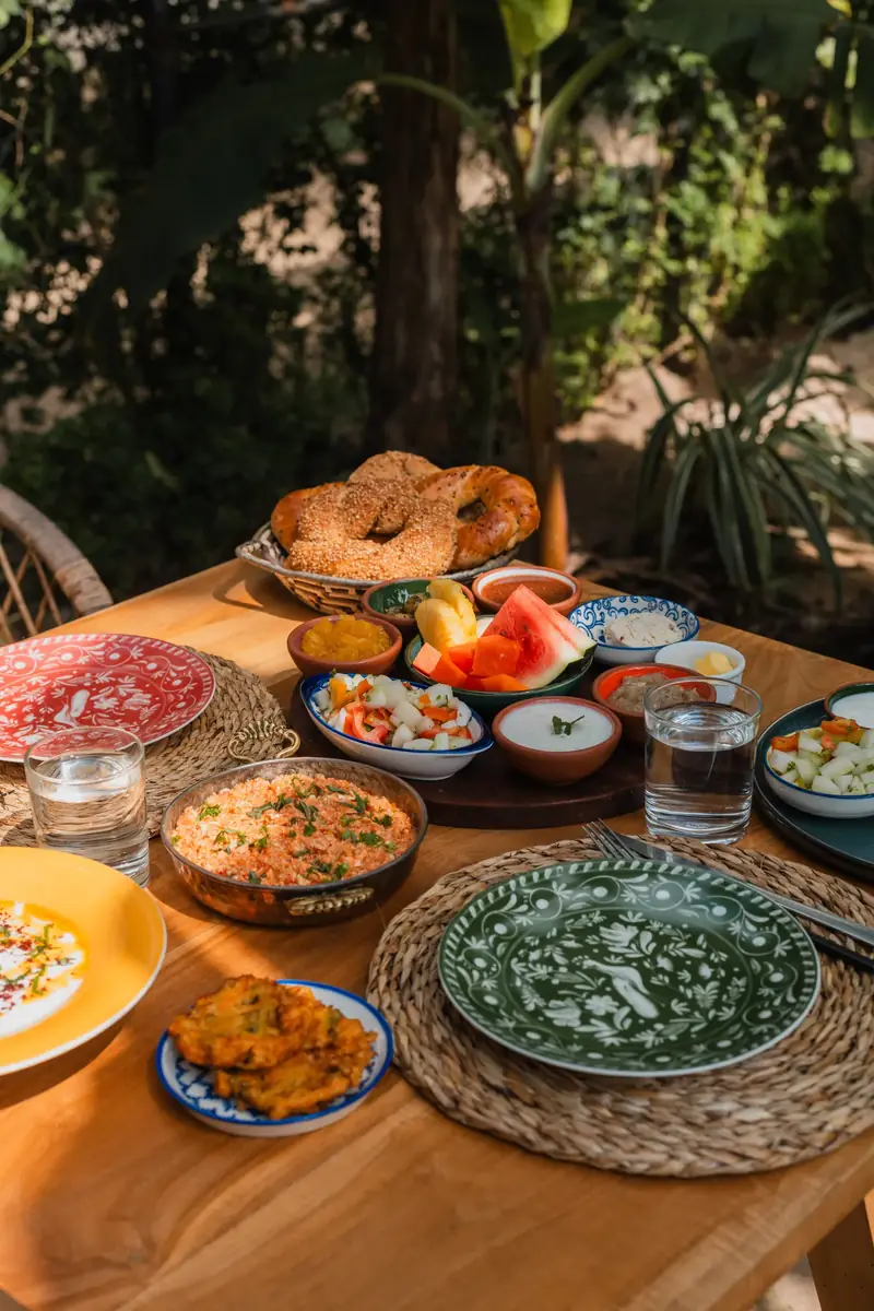
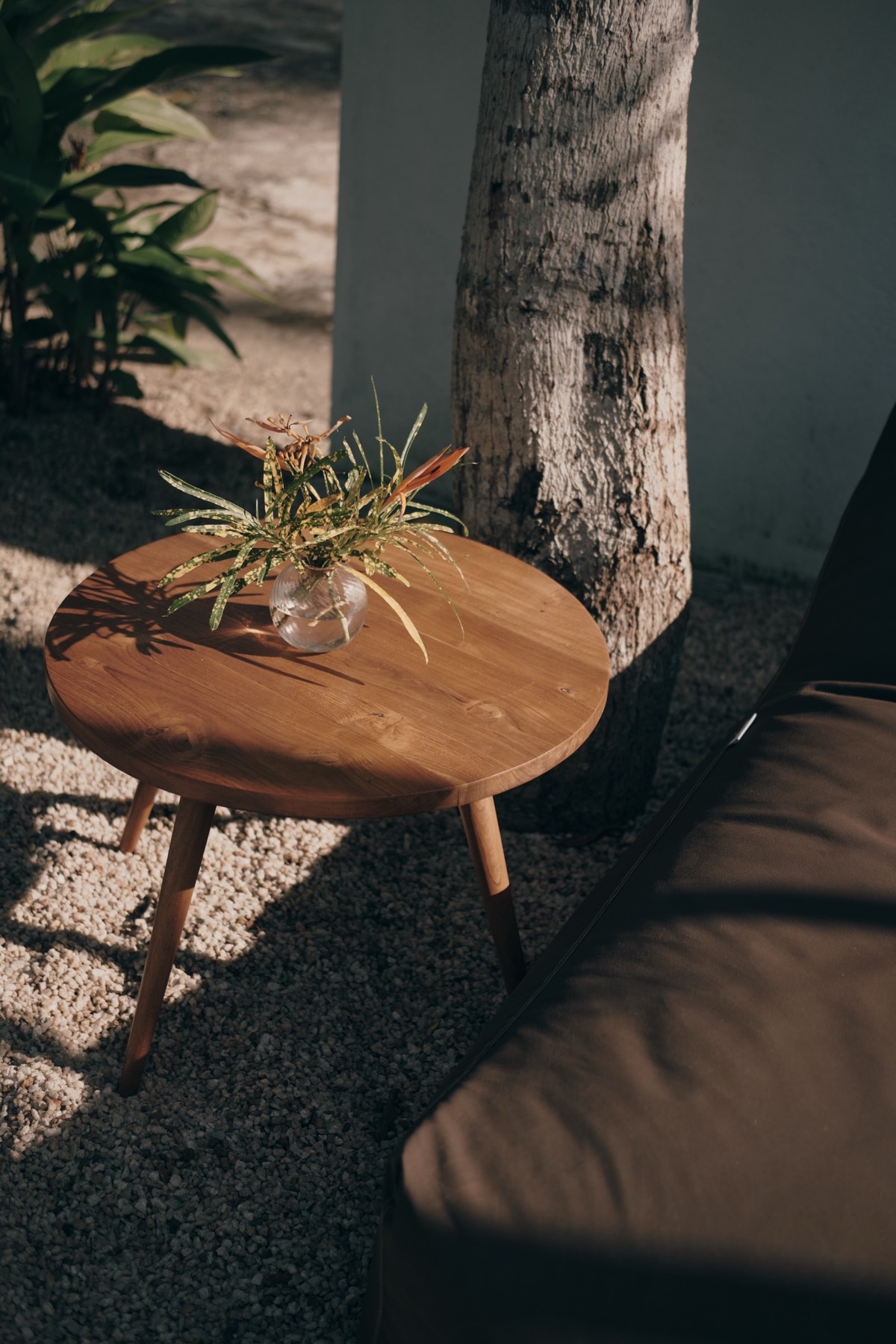
Your own door — then, eight hundred metres away, a table like this one.
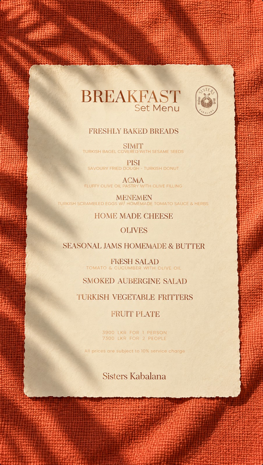
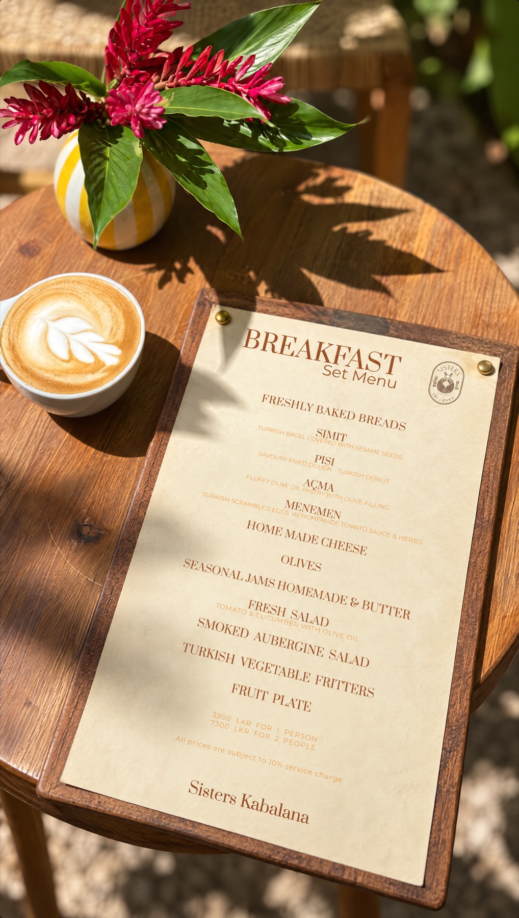
The set menu, and the same menu on the café table.
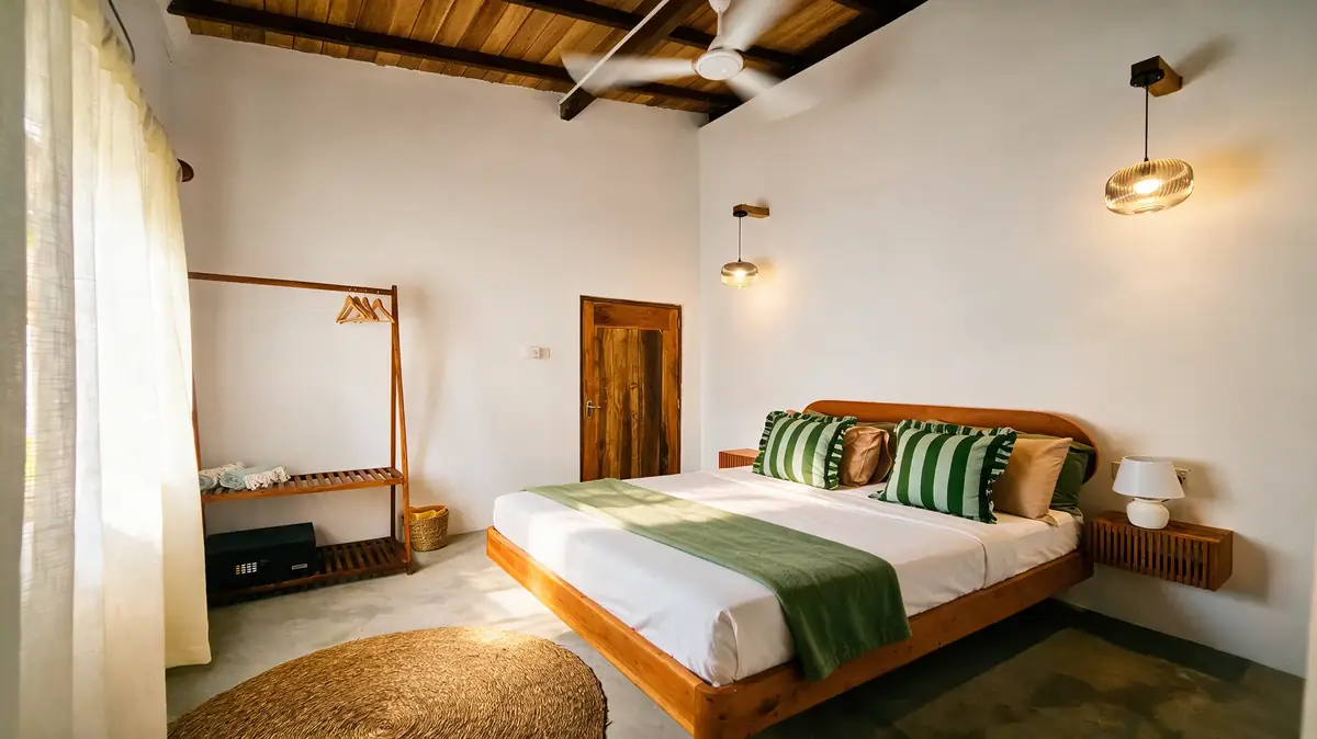
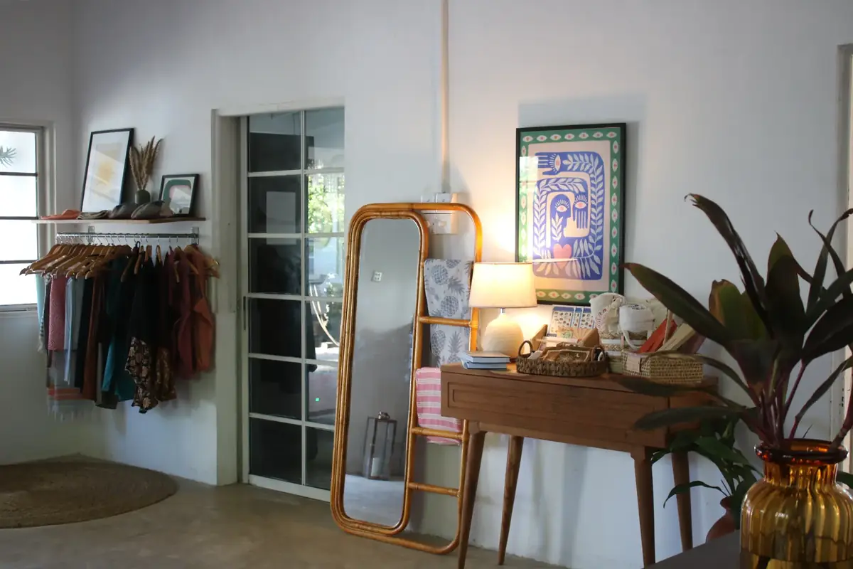
Sleep, and the shop tucked in behind the café.
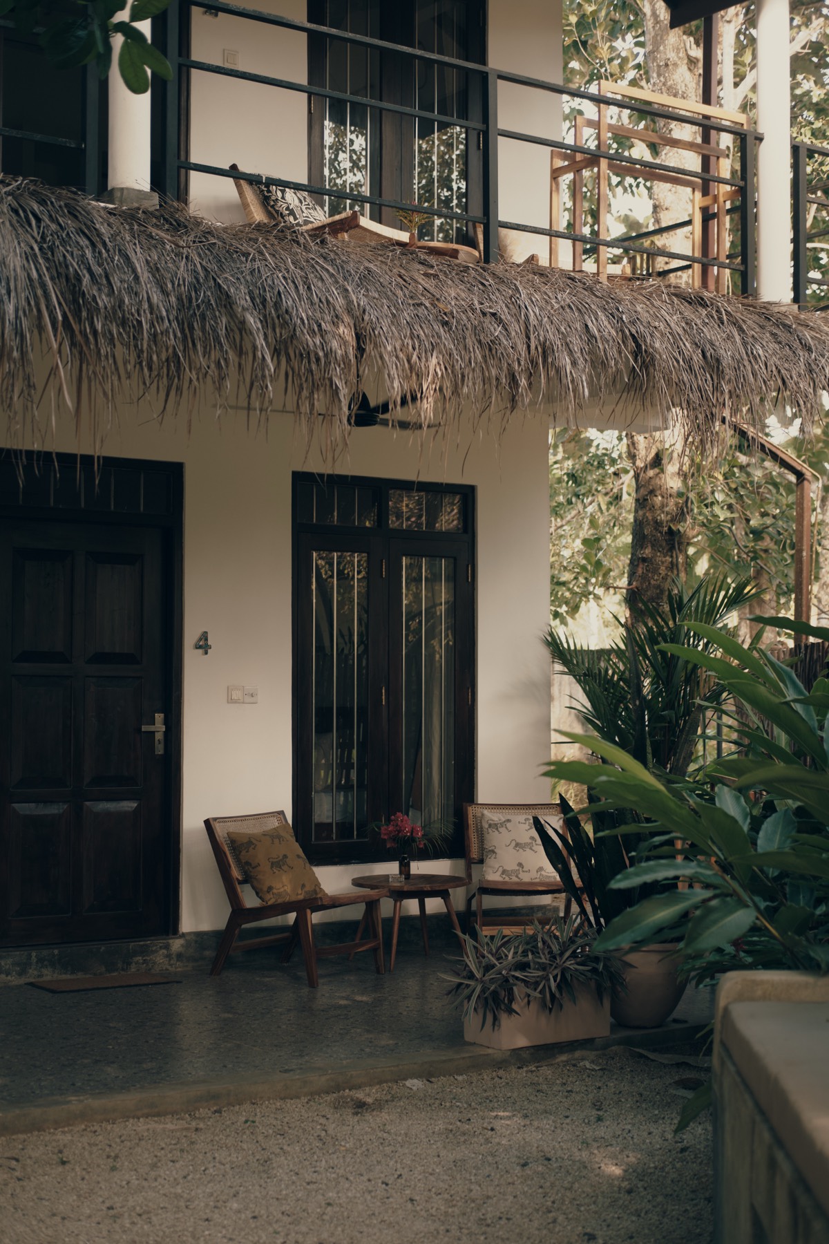
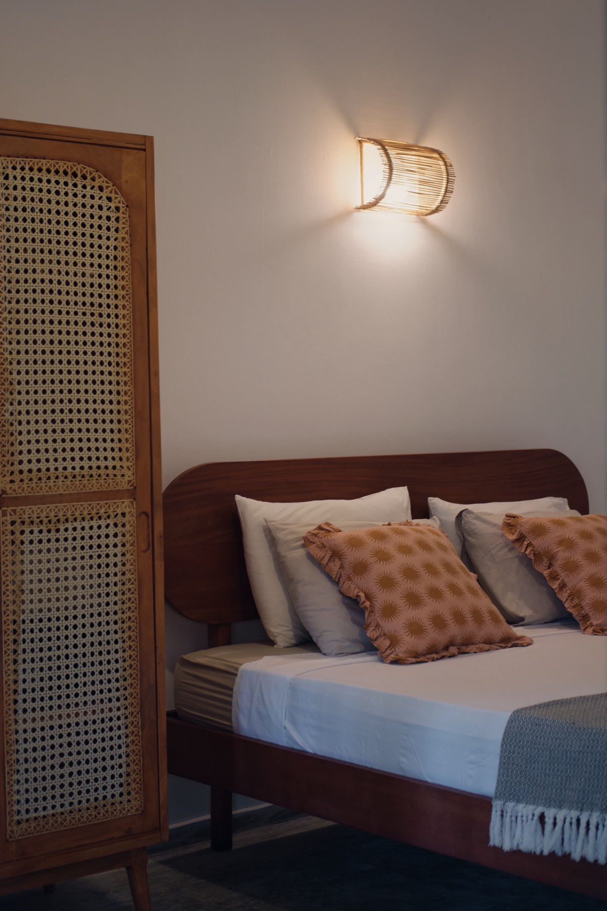
A room, inside and out.
02 The identity
The mark
They had a name and nothing under it. No mark, no palette, no type. Trading since 2019, 417 reviews deep, fourteen women on the payroll — and nothing to put on a cup.
The peacock wasn't the first animal on the table. A monkey came close, until it didn't — in Sri Lanka the monkey reads as a pest, not a symbol, and that ruled it out fast. The peacock won partly because it was already there: peacocks are common around Ahangama, and a couple still turn up on the guesthouse roof now and then. Partly, too, because of what they mean locally — elegant, prestigious, royal, the same register Sisters Away was reaching for. The fourteen women who work across the guesthouse and café were the ones who confirmed it landed.
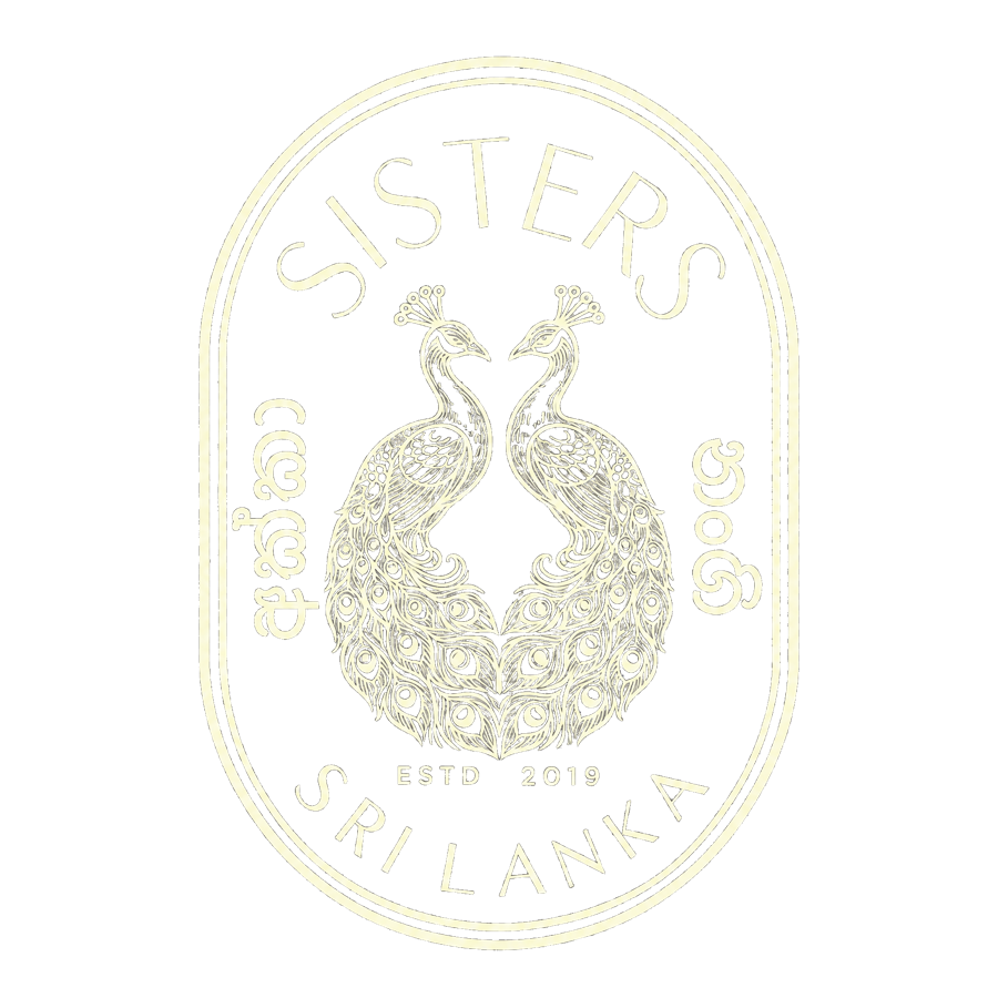
The drawing is two peacocks facing each other inside an arch — a second read, the two sisters, sitting underneath the first. Around them, SISTERS above and SRI LANKA below, Sinhala either side, and ESTD 2019 between their feet — the year they started, not the year I drew it.
Three names had to hold under it. Someone can arrive at the café and never meet the guesthouse, so each stands on its own doorstep, its own first line, while the type and spacing stay identical. Related by build, not by badge.
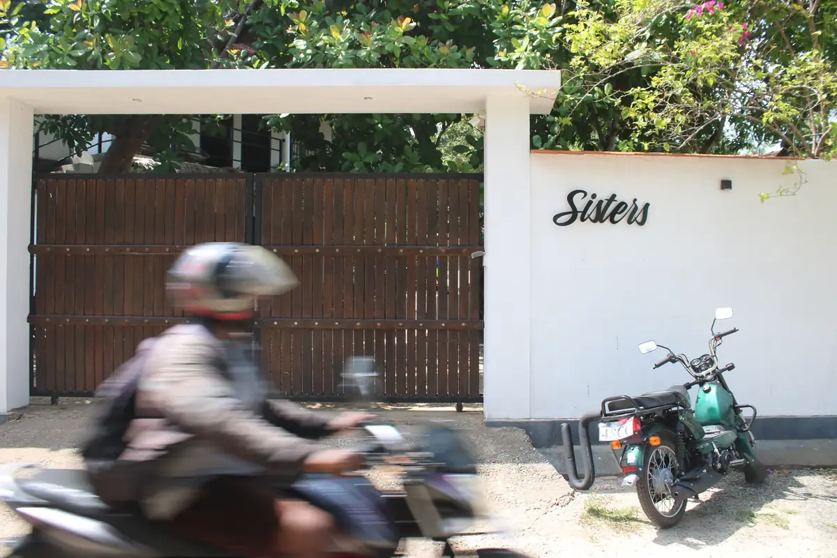
The gate still carries the old script. It comes down when the new one is cast.
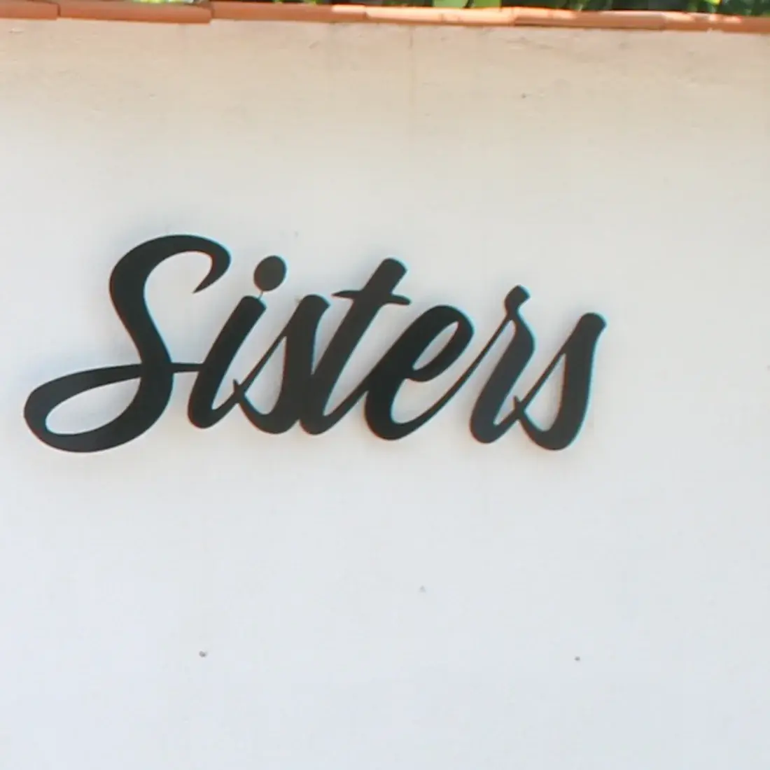
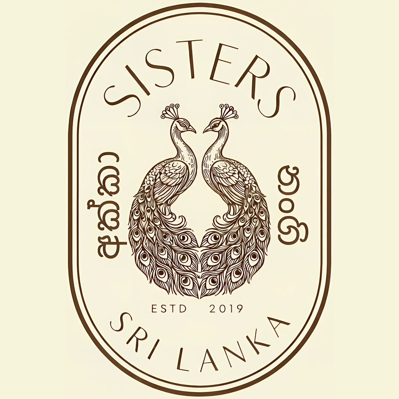
The old mark is still on the gate. The new one is already on the cups.
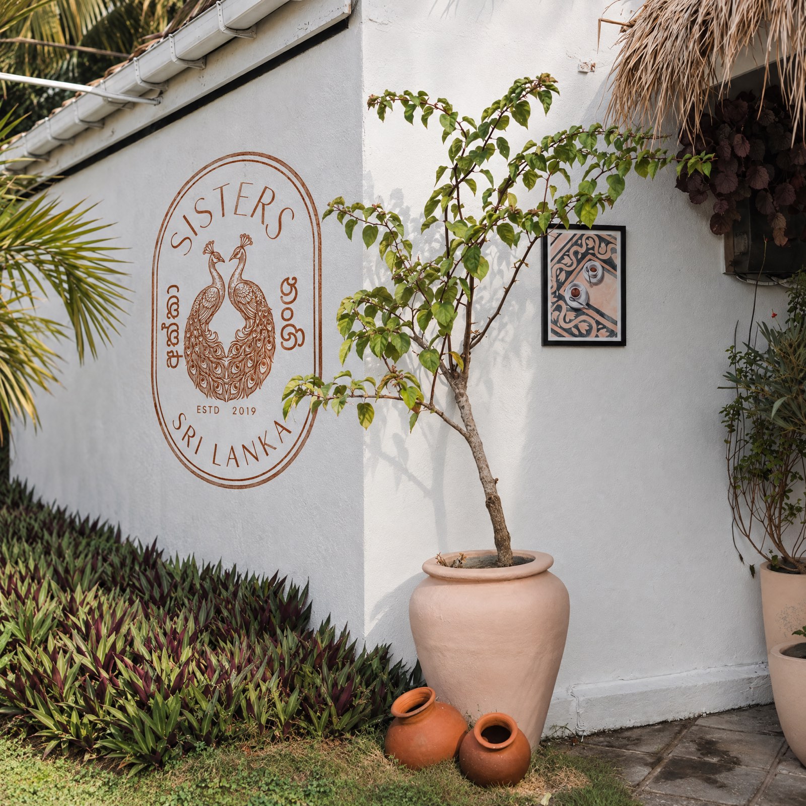
Hand-painted at guesthouse scale, on the entrance wall.
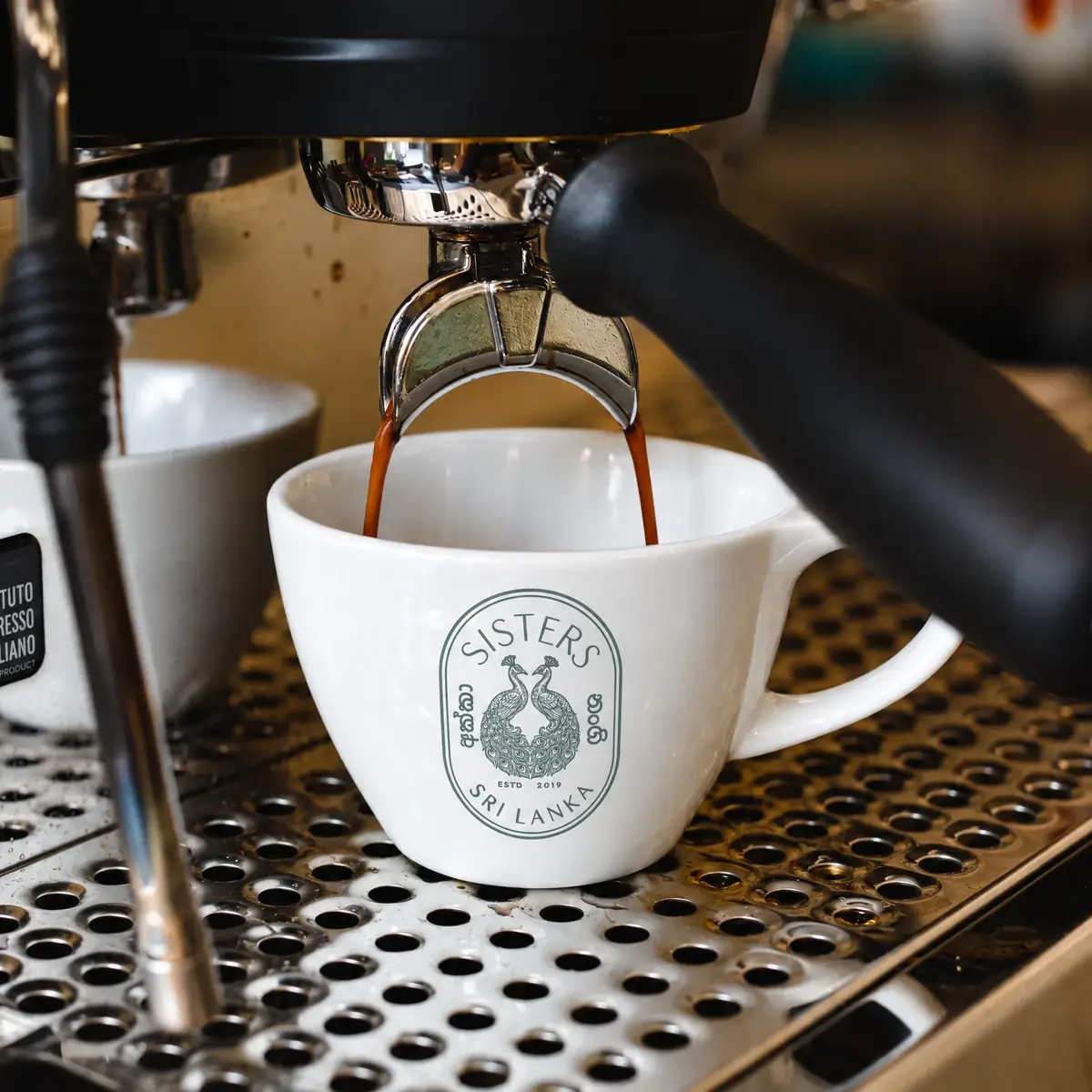
Printed in a soft, muted grey-green — not black.
03 The system
The palette and the type
The palette came out of the same discovery work as everything else — a questionnaire, an avatar for who actually stays here, then reference images the sisters responded to before a single colour was chosen. It settled into two tiers: warm terracotta, cream and sienna carrying the everyday weight, and a brighter set — pink, yellow, teal — held back for accents.
The typeface is Prata. Real candidates, set side by side, until one matched the crest's own quiet formality instead of competing with it.
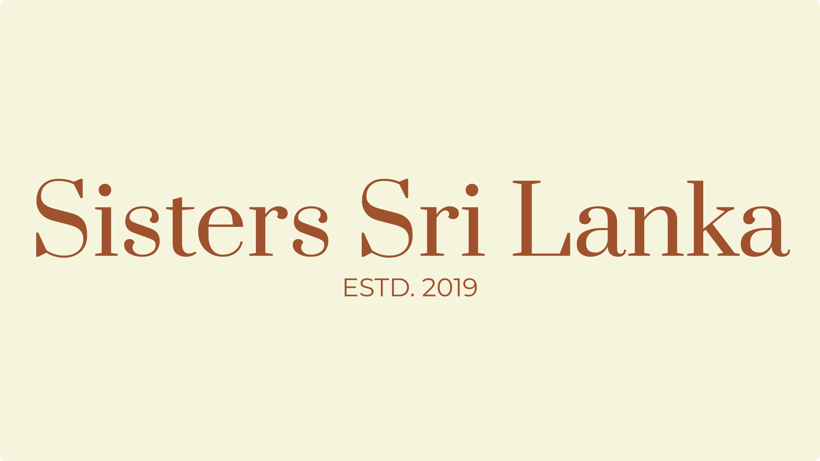
Wordmark in Prata; the palette in two tiers — everyday, then accents.
04 The writing
How it sounds
Small places get talked up. This one does not need it. “Only five places to stay. They go quickly.” “Turkish breakfast, all morning long.” “Two sisters from Istanbul who never went home.” “Small by intention. Considered by design.” Short lines, plain facts, no adjectives doing work the place already does.
None of it started with me. Burcu and Burçin gave me the material — what they wanted said, and how they'd say it — and I wrote and rewrote it from there. Written from their material, in their voice, not mine.
The site itself — Sleep, Eat, Shop, one roof, two speeds.
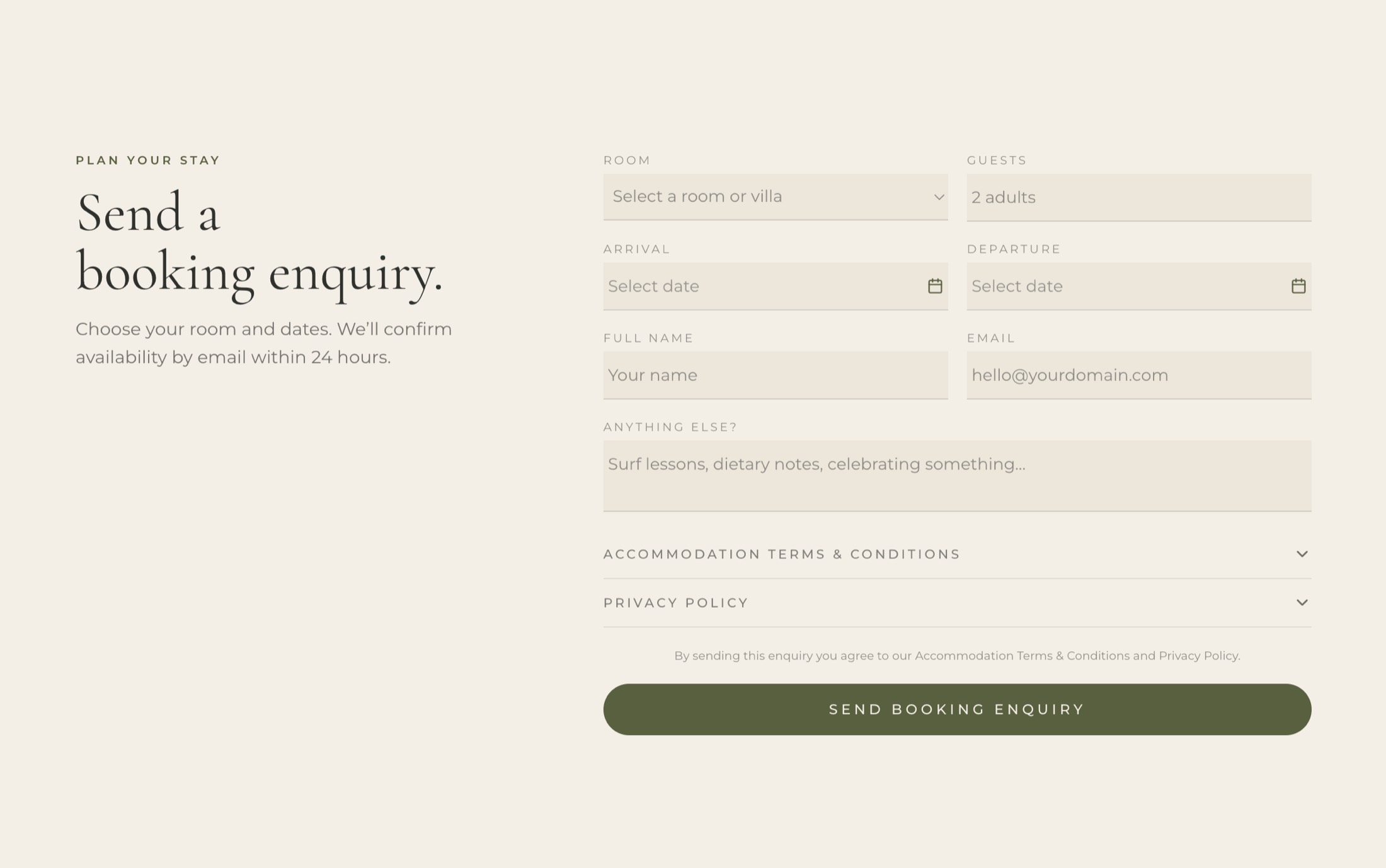
Dates and a name. Availability confirmed by email within a day.
05 After launch
Six months, then the keys
They asked me to stay on, so I run the site for six months — the domain and hosting already theirs. Then it moves to an editor they drive themselves: prices, dates, photographs, words. The handover is a date in the diary, not a promise.
06 Where it stands
What is true today
Sisters Away holds 4.9 across 129 Google reviews. Sisters Kabalana holds 4.9 across 288. The site ranks first for the café and second for the guesthouse — above their own Instagram and every aggregator — and the description Google chooses to show is the one written for it.
Figures read from Google, September 2026. No causation claimed — search rankings have many parents.
Five weeks, against a brief of six to eight
Brand, site, copy, and the technical work that made it findable.
If you run a small place that people already love and have no way to send them, that is the same job.